From the documentary and historical perspective, wine bottle labels form a part of what archivists and librarians term “ephemera”, a term which, as Rosario Ramos Pérez – who is in charge of the Ephemera collection of the National Library of Spain – explains, defines “that which lasts just one day”. The term appears to have been applied in English from the 1970s to define printed ephemera, the expression which John E Pemberton applied to documents which “are not intended to survive the currency of the message”. (Ramos Pérez 2003:11)
Thus the labels on wine bottles, like those of any other product, have an expiry date, not so much for their contents but rather for the function of the label itself which, in theory, disappears along with the wine. Like an empty box of chocolates, a bottle of wine, labelled or not, ceases to serve the purpose for which it was created when it no longer protects its contents and, no longer having any use, is thrown out along with the label.
This ephemeral character of an item of daily use and of little value means that labels, like other similar materials in daily use such as publicity leaflets, theatre tickets, restaurant menus, greetings cards, postcards etc. are not generally kept. Probably because it is an ephemeral product, thrown away when no longer of any use, not much has been written about the iconography of the Sherry label, or those of other Andalusian wines for that matter. However, thanks to the work of enthusiastic collectors – to whom we owe a debt of sincere and heartfelt thanks for seeking out and collecting these labels – collections of them have been conserved and exhibited in recent years at thematic exhibitions or at wine shows, and those specifically related to Sherry.
For example at both the exhibition “Solera” on Spanish wines and that of Wines, Vinegars, Spirits and Liqueurs from the Province of Cádiz labels of Sherry and other wines from the province were on show, lent by the various collectors. Something similar happened in Málaga, where there were two notable exhibitions of labels from the collection of Manuel Martínez Molina. The first was the catalogue for an exhibition of Málaga wine labels; the second, a short work – we don’t know why it was edited - of barely 34 pages, of which 20 are dedicated to the reproduction of some other labels of “Andalusia”, in both cases with two very brief texts of barely 5 or 6 pages each.
Nevertheless, there are not many specific in depth studies on the iconography of the labels. On Sherry labels specifically, besides mentioning some of my own work cited in the references below or that of Juan Ramón Cirici on their aesthetics, the work of Ana María Gómez Díaz on Sherry labels stands out. Her studies include those on the Gypsy woman in Sherry publicity, the flamenco woman on labels or her treatise on labels reflecting aspects of the Spanish War of Independence, among others. Also worth highlighting is her authorship of an excellent work, sadly unpublished: Iconography of the Publicity of Wine from the Marco de Jerez (1850-1935).


The label as a form of publicity
The need for the wine trade to look for a particular design arose when it was understood that it was necessary to differentiate the product on the market and offer regular, and occasional, customers a mark of guarantee so they could trust the product on sale. Thus the labelling of bottles emerged - rather late, for sure, as we will see –as well as the application of graphic design for the bodegas and the various wines.
The Dictionary of the Spanish language, in its third meaning, shows that a label is a “tag”, that is to say an identity card which is usually attached to merchandise and carries the producer’s mark or some other kind of indication. So the tag is used as a sign of identification, valuation, classification etc.
The notion of branding products is ancient, as old as that of publicity, something which many authors have no hesitation in dating to the very beginnings of trade; there are even those who offer as the first example the apple offered by the serpent to Adam, since that offer includes three of the different states of mind which a merchant wishes to transmit to a customer to make a sale: attract their attention, awaken their interest and arouse a desire to possess.
In Pompeii the first maker’s marks were already being used: 6 Pompeian bakers identified their loaves of bread with labels; and the case is always mentioned of a certain Escauro, a fish sauce magnate who distinguished his three qualities of sauce with an indication referring to the quality of each one.
__________________________________________________________________________________________________________________________________________________________________________________
2 El presente artículo es una versión actualizada y ampliada sustancialmente de otro publicado anteriormente por su autor (Ramos Santana, 1996: 61-78).
3 En su cuarta acepción, el DEL menciona que etiqueta es una “pieza de papel, cartón u otro material semejante, generalmente rectangular, que se coloca en un objeto o en una mercancía para identificación, valoración, clasificación, etc.”.4 Además del trabajo de Feliú, sobre la publicidad en general, sus técnicas y su historia, pueden verse Puig, 1986; Haas, 1971; Checa Godoy, 2007; García Castillo y López-Sánchez, 2009. Este último libro tiene varios trabajos dedicados a la publicidad de bebidas alcohólicas.
5 El cuarto y último estado de ánimo es provocar la adquisición. La consecución de esos cuatro estados de ánimo, atención, interés, deseo y adquisición –cuyas iniciales conjugan la clave AIDA– es el objetivo de la publicidad, y por supuesto del vendedor. Al respecto puede verse, además de la obra de Emilio Feliú García antes citada, Rey, 1992: 15 y ss.6 Conviene recordar que en Pompeya –y su uso debió ser común en la Antigüedad– se institucionalizó la enseña, que consistía en esculpir sobre piedra una figura representativa de una actividad industrial o un comercio, símbolos que a veces se grababan en las piedras de la calle. Del emblema general de una actividad –una cabra para las lecherías, una corona de laurel para las tabernas, un falo para los prostíbulos...–, se pasó a signos concretos para industriales, comerciantes, o simplemente individuos particulares, en lo que podemos entender como la implantación de una marca. Sobre la vida en Pompeya véase Laurence, 2007. RIVAR Vol. 5, No 14. Mayo 2018: 201-222. __________________________________________________________________________________________________________________________________________________________________________________
But without going back too far we should remember that commercial publicity is something which came about as a phenomenon of social transcendence during the second half of the XIX century, and this rise has an intimate relationship with the triumph of the industrial revolution, which allowed widespread expansion of consumption among the people. It is precisely this generalisation of consumption and the needs of business itself which made necessary the distinction of the product according to its origin.
Wine producers of Andalucía soon became aware of the necessity to distinguish their different wines; it shouldn’t be forgotten that since the XV century the wine business in some parts of Andalucía had been experiencing a certain boom beyond the peninsula with growing exports. However because the containers all looked the same branding irons soon came to be used to distinguish them, as much for the producer as for the client, as a way of guaranteeing the origin of the wine.
Wine went from sale in bulk in large wooden barrels to being sold in bottle, and thus more widely, in the last quarter of the XIX century. At this point the identification of bottles according to the bodegas they came from became more necessary. At times differently shaped bottles were used or the glassmakers were asked to include some kind of identification mark, but soon customer demand and the need to reduce costs compelled producers to look for new forms of identification, since good customers wanted wines with particular characteristics, ones which still had significance in the bodegas and which were noted on the identification tags for use in the bodega. This system had been in use since the XVIII century by some English merchants to distinguish wines by their type, origin and quality either in the form of tags stuck to the bottles or as little metal neck collars. These collars, in engraved silver or enamel, were used to identify certain clients using an initial or a word and this became a sign of distinction and elegance; also their use was frequent by select consumers in the drawing rooms of their residences. Thus, what started out as a mere necessity for good service to good customers, became an attractive sign of distinction and a way of attracting new customers or, it could be said, a certain form of publicity. The latter took off, and it is still understood as a persuasive form of communication which sets out to achieve a favourable disposition to try, continue and increase consumption of a particular product in the people it is aimed at.
We have seen how commercialisation made clear identification of the product necessary, and that the brand became essential for its own commercialisation and publicity. The brand is the seal of individuality of the product to which it gives its name. Thus it has a publicity value of its own and a brand is chosen to identify a certain quality of the product. When wine began to be sold in bottle, what better than to merge the brand – as a guarantee of quality – with the publicity as a way of popularising and selling the wine? Thus the label became the symbol of the producer and attracted the customer.
_______________________________________________________________________________________________________________________________________________________________________________--__-
7 Sobre las relaciones de la publicidad con la generalización del consumo, consecuencia, a su vez, de la difusión de la revolución industrial, véase a León, 1980; Föhlen, 1978; Ariès, Duby, 1992a y 1992b.
8 Manuel María González Gordon indica que ya a principios del siglo XVII se usaban marcas de hierro para los toneles (González Gordon, 1970: 436 y ss).
9 Remitimos a los trabajos citados anteriormente de Feliú García, 1984; Checa Godoy, 2007 y Puig, 1986.204 RIVAR Vol. 5, No 14. Mayo 2018: 201-222. _________________________________________________________________________________________________________________________________________________________________________________
In the search for an effective label or general publicity nowadays, specialists are consulted like statisticians, economists, sociologists, psychologists and of course artists and designers. Something similar was already happening in the XIX century and within the sociocultural context of the era professionals were consulted, mainly artists), to create labels. In fact when we examine old labels we can see that the artists understood the theory of publicity.
The primary function of publicity is memory: the text must be simple and to the point. Illustrations must be eye catching, simple and direct to attract the consumer in a very short time. If this is true generally with publicity, it is all the truer with labels where the text must complement the illustration, saying what cannot be said in images, so it needs to make a powerful simple announcement. It is the same with the brand name which must present the best association of ideas, in line with the image and message required.
Yet the illustration is fundamental since it first attracts the attention by its shape, colour and the idea it intends to get across, with or without brand name or text, making it into a symbol for the product, even the producer. The message must go straight from the image to the potential customer’s sensibilities, producing an impression which is hard to forget and easy to identify.
It should be remembered that in general the message is aimed at contemporary customers and the label has at least two aspects: on the one hand there is a sort of code determined by the style of design; it could be modernist, abstract or very realistic. Choosing a style is selecting a code and with it the cultural significance which makes the customer form a particular image of the product.
On the other hand is the chosen theme which should be easily recognised by the customer and with which they should identify. So the choice of the illustration and illustrator is not some simple personal whim, but a careful judgement. Designers cannot be separate from the sociocultural context of their times, so we work with the conventionally accepted idea that in every society there is a dominant culture which defines it.
____________________________________________________________________________________________________________________________________________________________________________
10 Los inicios de la utilización del trabajo de artistas, fundamentalmente pintores, en la publicidad, como cartelistas y creadores en general, en Feliú García, 1984: 35 y ss.
11 Una interesante reflexión sobre la relación de la publicidad con el arte se puede encontrar en Núñez López, 1997: 69-108.
12 Sobre la importancia de la publicidad para provocar la atracción del consumidor de vino, véase Albisu Aguado, 1989.
__________________________________________________________________________________________________________________________________________________________________________________
Historical context: The Spain of the Restoration
Let us take a look at the historical and cultural context in which these old Sherry labels came about more than a century and a half ago which will give us the key to understanding the underlying mind-set of the time.
In the XIX century, with the spread of thinking, liberal ideology and the growth of nationalist movements in Europe, links were sought with the past after the ideological and mental rupture brought about by the triumph of the bourgeoisie over the old class system. Local and regional sentiment was reinforced and there was a drive to defend the traditions of each country, reaffirming national traditions and customs.
In the last quarter of the century, Spain was still predominantly rural both in terms of population distribution and the importance of agrarian activity to the national economy. So many inhabitants were so deeply rooted in the countryside that even at the start of the XX century most Spaniards organised their festive and social lives according to plant cycles or the Catholic Church, a situation which lasted virtually unchanged through the Dictatorship.
At the same time, ideological and political conflict along with the wars which continued despite periods of apparent peace –for example the War of Independence against the French, the Carlist Wars and the almost interminable struggles in North Africa – demand a reaffirmation of what is Spanish which serves to sustain and develop the national spirit. All this upheaval, to sum up, resulted in a search for the collective identity of a people looking for common objectives and achievements and thus a past with their own distinctive traditions.
At the same time we can’t forget Spain’s external affairs. The empire forged from the end of the XVI century in America began to face the stirrings of emancipation movements from the final decades of the XVIII century, and they became a reality in the first quarter of the XIX. In reaction, the Spanish administration, and Spaniards in general, tried to consolidate features of Spanish identity in the remaining colonies, especially Cuba and Puerto Rico. But from the 1860s in Cuba - Spain’s pearl of the Antilles - an independence movement began and the Spanish anxiously watched the final disintegration of the old colonial empire. We are all familiar with how heavy-hearted the reaction was, with the loss of hope and the general sensation of defeat caused by the loss of Cuba, Puerto Rico and the Philippines in 1898. This resulted in attempts to dig deeper in search of the identity of the Spanish as a people, revisiting the past, recalling the glorious memory of what it was to be Spanish and reinforcing links between the people and their culture and traditions: this was ideological and cultural regeneration which left its mark on the lives of the Spaniards. We can see all of this reflected in labels of the period.
In this sense the mythical return to the land, to nature, which can be seen in practically all the art of the time, is one more way of highlighting the traditional character of Spain and the Spanish; it is in the lower level of economic status where representation of a less contaminated and more genuine Spanishness was sought.
_________________________________________________________________________________________________________________________________________________________________________________________________________________________
13 Aunque para un tema concreto diferente, como es el de los mensajes publicitarios en las fachadas de los establecimientos, son de interés las reflexiones sobre este tema de Corazón, 1979.
14 Sobre las etiquetas y el proceso de equitetaje en el Marco del Jerez, véase González Gordon, 1970: 502 y ss.
15 Donald M. Lowe señala que tras el triunfo de la sociedad burguesa, sus habitantes “habiendo experimentado la sensación de discontinuidad entre el presente y el pasado, enfocaron la tradición desde fuera como un ‘otro’ romántico” (Lowe, 1986: 81).
16 Estos aspectos los hemos tratado anteriormente en Ramos Santana, 1992: 13-23.
17 Sobre la reacción y la actitud de los gaditanos ante la pérdida de Cuba, paradigmática de la reacción de los españoles en general, véase Baraja Montaña, Cádiz, 1979 y Ramos Santana, 2002: 25-38.
18 La reacción de los pensadores españoles ante la situación de crisis de pensamiento que supuso el 98 para España, queda bien reflejada en la obra de pensadores como Valentí Almirall o Rafael Altamira. Almirall, 1972; Altamira, 1988. Una reflexión con una perspectiva más alejada cronológicamente de los hechos en Tuñón de Lara, 1986. RIVAR Vol. 5, No 14. Mayo 2018: 201-222. __________________________________________________________________________________________________________________________________________________________________________________
Sherry labels between 1860 and 1920
When we look at old Sherry labels we can see that the people featured are flesh and blood, real people, prevalent in social circles at the end of the XIX and beginning of the XX centuries. An important group of these people was formed by those popular personalities who burst onto the scene in notable events inspiring sensation, respect, fear, admiration; breaking the humdrum of daily life with their presence, their actions: prominent people, smugglers, soldiers, bullfighters and even the nobility.
Spaces, personalities and stories offered an optimistic vision of daily reality presented as the most genuine image of Spain. A clear example can be seen in forms of dress where we see traditional outfits becoming the typical dress of a country or region.
Thus an image was developed and spread of a Spain dominated by guitars, tambourines, flamenco and bullfighting, indisputable popular realities which show a Spanish people throwing themselves into their “traditions”.
Representations of nature also became models of this focus on the image of traditional Spain. We see fruit and animals (generally “noble” ones of an aristocratic nature: horses, bulls, lions, deer… ), countryside or seaside scenes, always luminous and brightly coloured.
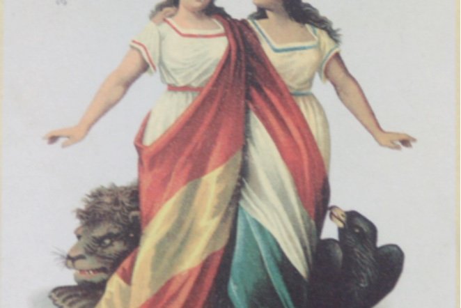
America seems ever present as a memory and recognition of the glorious Spanish past; these are symbolic and significative representations (natives, hunters…) but always with a positive character. They never offer a pessimistic vision of the common past of the Spanish and the Americans, like the label which shows two women representing America and Spain together leaning on a bust of Columbus, while at their feet lie a lion representing Spain and a bird of paradise representing America as well as coats of arms representing Spain and the American nations (figure 1); or the label of two women draped in their respective flags representing the union of Mexico and Spain (figure 2).
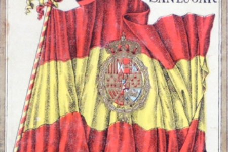
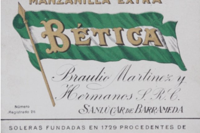
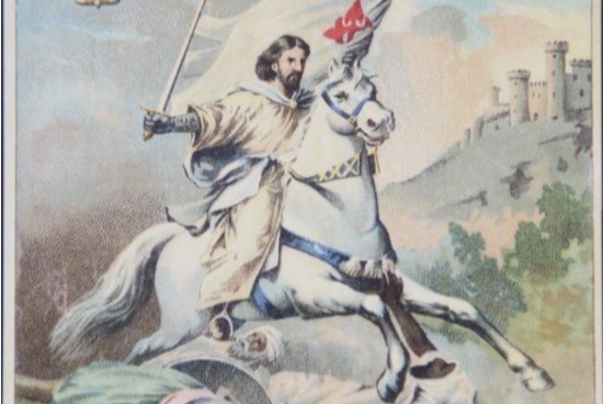
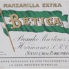
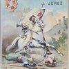
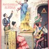
In this same sense, among those we could classify as labels which reinforce nationalist sentiment, the national flag is used (figure 3) and even the flag of Andalucía to label a Manzanilla called “Bética” (figure 4). There are illustrations of military scenes, literary people, fictional characters identified with the Spanish character like Don Quixote; or historical events, in many cases alluding to events of long ago, like the conquest of Granada or the discovery of America, labels which are inspired by - if not directly copied from – the works of well-known artists.
__________________________________________________________________________________________________________________________________________________________________________________
19 Las etiquetas que ilustran este trabajo proceden de la “Colección Saldaña”, de las que ilustraron la exposición “Vinos, vinagres, aguardientes y licores de la provincia de Cádiz” (de la que fue comisario el autor de este trabajo, en 1997) y de la propia colección de quien suscribe.
20 Sobre la importancia simbólica del caballo como distintivo de encumbramiento social, véase a Caro Baroja, 1983: 3-36.
21 Las relaciones del mundo del vino con los caballos y los toros son objeto de las reflexiones de González Troyano, 1898: 57-59.
22 Los ilustradores de las etiquetas cumplen así lo que Jean Starobinski considera “una de las vocaciones esenciales de la pintura: glorificar el espacio y la luz”. Starobinski, 1988: 17.
23 Junto a don Quijote, Sancho, tema frecuente, por razones obvias, de Bodegas Sancho, de El Puerto de Santa María.
24 Señala Jean Starobinski, refiriéndose al final del siglo XVIII, que la conciencia histórica “se hace más aguda” con el fin de siglo; consideración que podemos aceptar para todos los fines de centuria, y sin dudarlo para la España de finales del siglo XIX (Starobinski, 1988: 169). RIVAR Vol. 5, No 14. Mayo 2018: 201-222.
__________________________________________________________________________________________________________________________________________________________________________________
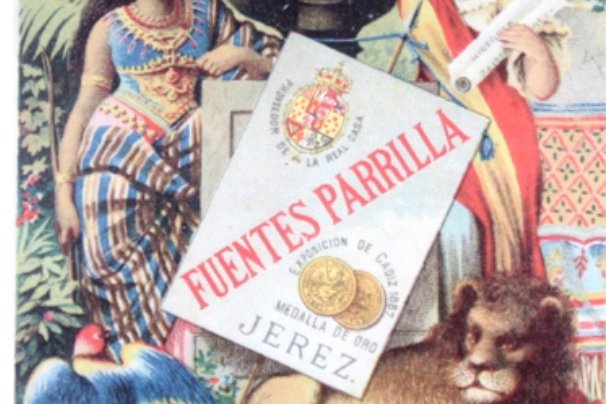
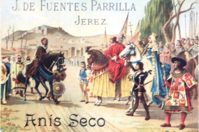
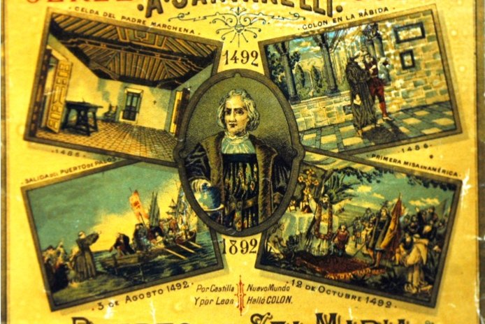
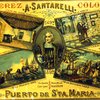
For example, in the label for Anís Seco from Bodegas Fuentes Parrilla which shows the handing over of the keys to Granada by Boabdil to the Catholic Monarchs (figure 5), the designer copied the famous canvas of Francisco Pradilla painted in 1885. Very interesting for its documentary detail is the label for “Jerez Colón” from Bodegas A Santarelli (figure 6), which as well as a bust of Columbus includes four images of his first journey, all based on recognised artworks, like the image of the departure from Puerto Palos which is inspired by a picture painted in 1875 by Antonio Guisbert; the scene of Columbus at the monastery of La Rábida, inspired by a work - now lost – by Juan Llimona painted around 1877; or the scene of the first mass which takes elements from a work of 1862 by Dióscoro Puebla showing Columbus disembarking in America.
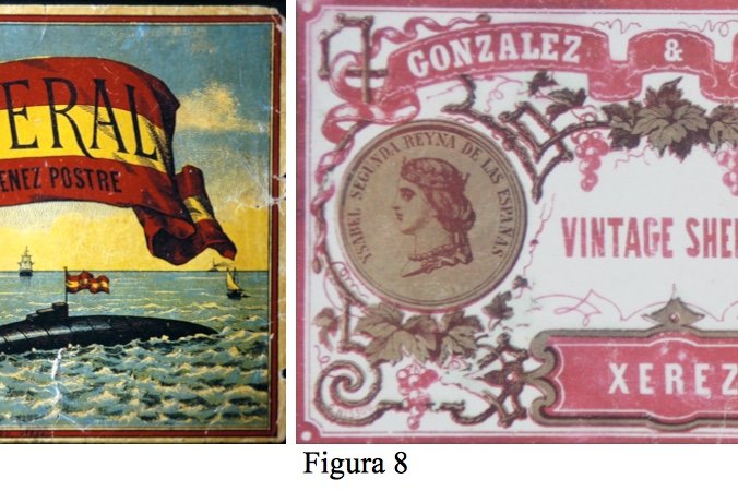
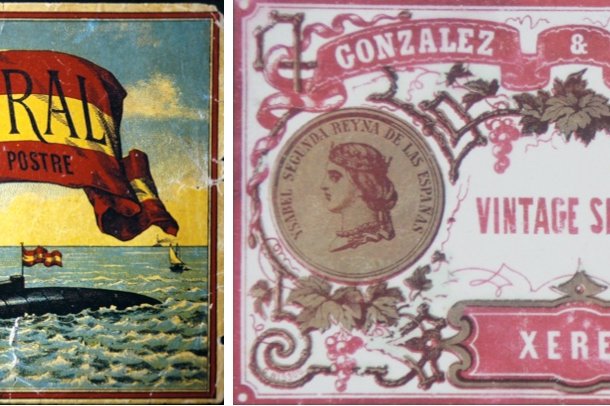
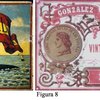
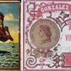
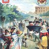
There are labels which pay homage to more recent personalities, almost contemporary, but they offer reasons for pride in an era aware of its decadence. Outstanding among these are the labels dedicated to Isaac Peral -inventor of the torpedo submarine which went down in history named after him – as is the case of a “Pedro Ximénez” dessert wine labelled as “El Peral” (figure 7). We also find a profusion of labels alluding to and paying homage to the Spanish monarchy. Of great interest are the labels of González Dubosq in which an image of Queen Isabel II appears on the front of a commemorative coin from the Agriculture Exhibition of 1857. On the back of the coin, as well as indicating the date and name of the exhibition, the expression “for merit” appears (figure 8) as a way of signalling an outstanding product which is without doubt one of the earliest wine labels from González Byass.
__________________________________________________________________________________________________________________________________________________________________________________
26 La empresa González Byass se denominó hasta 1861 González Dubosc y Cía., y etiquetó en torno a los años finales de la década de 1850 el fino Tío Pepe con un diseño igual a la de la etiqueta de la Figura 8, aunque antes editó otra bastante más sencilla, sin figura humana (Guerrero Gutiérrez, 1996: 15-29-)RIVAR Vol. 5, No 14. Mayo 2018: 201-222.
__________________________________________________________________________________________________________________________________________________________________________________
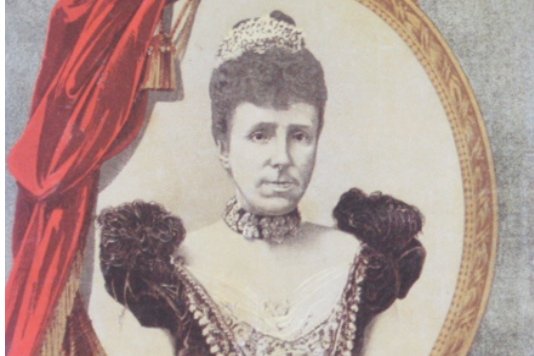
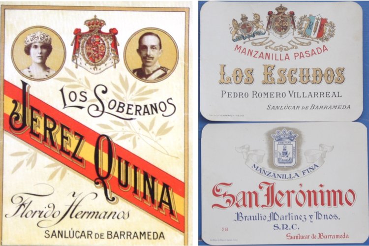
While there are very few labels dedicated to Alfonso XII, there is an abundance dedicated to his son and even to his widow María Cristina of Hapsburg who reigned as regent (figure 9); among the many of Alfonso XIII there is the notable Jerez Quina “Los Soberanos” which, as well as the arms of Spain included images both of the king and his wife, Queen Victoria Eugenia (figure 10). Many labels feature heraldic shields following a trend of ennobling Bodega proprietors at the turn of the XIX and XX centuries (figure 11) and shields are a sign of prestige.
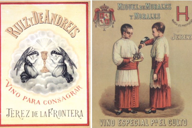
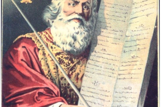
Running parallel to this patriotic sentiment is that of religion by which Spanishness is often likened to Catholicism, and thus the many representations of religious themes and consecration wines which were not only consumed by priests at mass. Nevertheless, there are many labels with symbolism of consecration and many more still showing altar boys (figure 13) and to a lesser extent, saints. There are also plenty of labels featuring motifs and personalities from the Holy Scriptures, notably Moses, who is habitually copied from a painting of 1648 by Phillippe de Champaigne, possibly the most famous representation of Moses with the tablets of the Ten Commandments (figure 14). Uniting religion and patriotism are the labels with the apostle Santiago, patron saint of Spain, with the image usually taken from the painting “Santiago at the Battle of Clavijo” painted in 1855 by Casado del Alisal (figure 15).
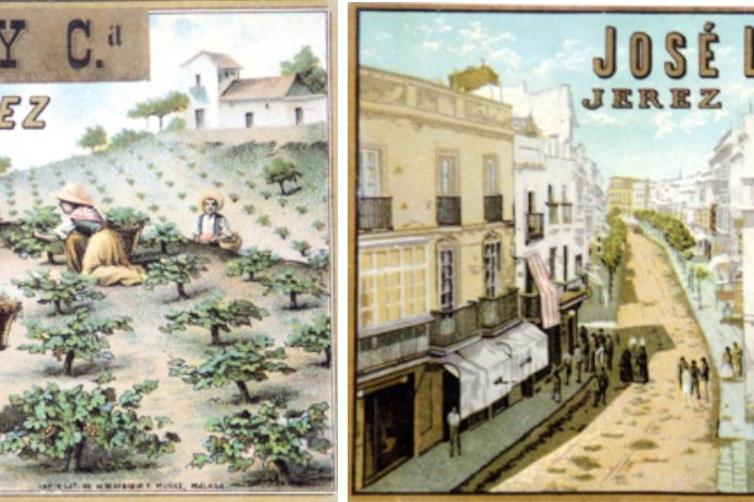
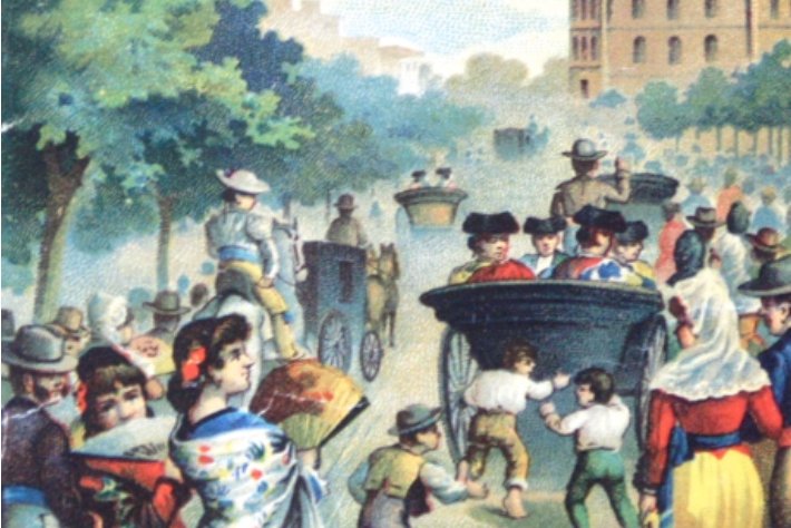
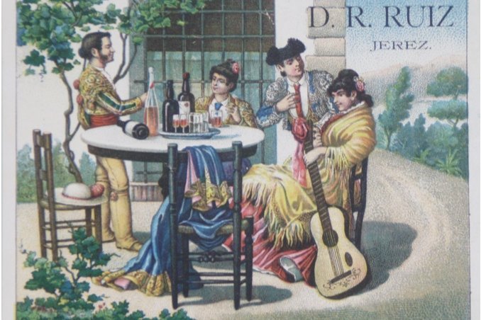
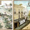
But without doubt the majority of Sherry labels chose to illustrate local customs, and are thus considered the most genuine in representing the spirit of Spanishness with their popular scenes which, although of all kinds, those we would classify as Andalusian predominate: people nearly always around a bottle wearing typical Andalusian clothes. They feature traditional clothing, the countryside of Jerez and the Bay of Cádiz with scenes in the vineyards, like that of Bodegas Molina & Cia with men and women bringing in the harvest (figure 16), or daily life in the streets like that of José Lozano showing the Calle Larga (figure 17), a common image in photographs of the era, or special days showing the atmosphere before a bullfight (figure 18).
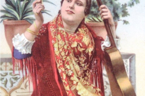
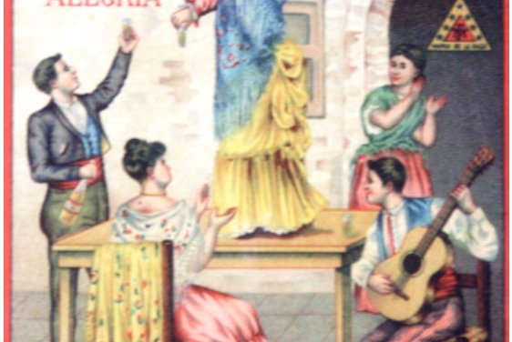
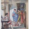
Designers paid special attention to themes related to popular culture such as scenes in taverns, ferias, flamenco and national holidays, usually copying designs from paintings showing late XIX century dress. Thus we see labels reminiscent of works by Rafael Arroyo, Ricardo López Cabrera, José García Ramos, Ángel Ma Cortellino, Eugenio Vivo Tarín or Luis Jiménez Aranda just to mention the best known. In this style there are many labels with a woman in flamenco dress and with a guitar raising a glass in a symbolic toast (figure 19), also festive scenes of singing and dancing either with a seaside background (figure 20)or that of an inn or tavern (figure 21).
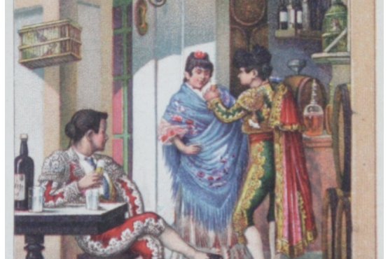
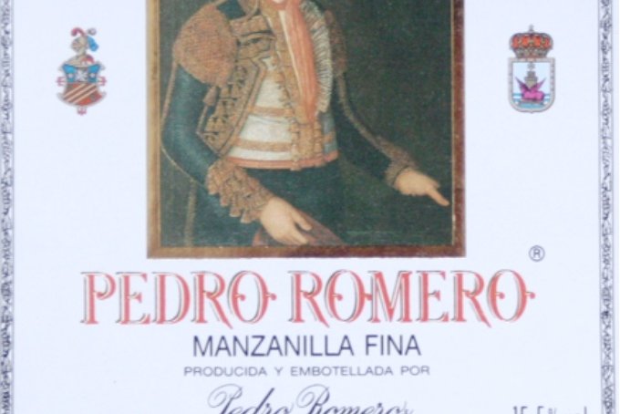
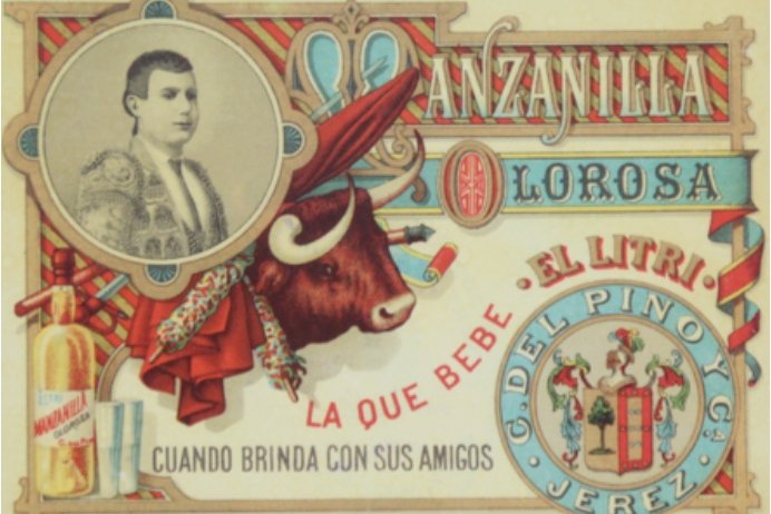
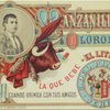
Alongside flamenco there are many labels featuring the bullfight linking the festival of the bulls with flamenco and wine. We see this in labels where the guitar, the woman in flamenco dress and the bullfighter are at a party or simply drinking in the tavern (figures 22 and 23). Many labels feature the bullfighters themselves, from the legendary Pedro Romero, who was painted by Francisco de Goya, whose work appears on a label (figure 24) to the Manzanilla label “Lo que bebe El Litri” (what El Litri drinks) (figure 25) as well as labels celebrating the likes of Joselito, Gallito, Larita, Fabrilo,Posadas, Guerrita,Lagartijillo, Revertito and many others.
This wealth of plastic and symbolic art begins to change in the second third of the XX century, when label design tended towards greater simplicity; what was important was to identify the bodega – the symbol of the representation of quality, the seal of guarantee – and the brand by which the wine would be recognised, so unfortunately other components began to slowly disappear.
_________________________________________________________________________________________________________________________________________________________________________________
27 Sobre la tendencia al ennoblecimiento de los bodegueros del Marco del Jerez, véase Ramos Santana, 1996: 159- 182.
Bibliografía
Albisu Aguado, L.M. et al. (1989). Actitud del consumidor ante la publicidad del vino. Madrid.
Almirall, V. (1972). España tal como es. (La España de la Restauración). Madrid, Seminarios y ediciones.
Altamira, R. (1988). Historia de la civilización española. Barcelona, Crítica.
Ariès, P. y Duby, G. (1992a). La revolución francesa y el asentamiento de la sociedad burguesa.
Historia de la vida privada. VI Tomos. Madrid.
------------. (1992b). La vida privada en el siglo XX, Historia de la vida privada. IX tomos. Madrid.
Baraja Montaña, M. (1979). “La Guerra de Independencia cubana a través de Diario de Cádiz, 1895-1898. Del grito de Baire, al hundimiento del ‘Maine’”. Diario de Cádiz, Cádiz.
Caro Baroja, J. (1983). “En torno a la literatura popular gaditana”. Revista de dialectología y tradiciones populares 38: 3-36.
Checa Godoy, A. (2007). Historia de la publicidad. La Coruña, Netbiblio.
Cirici, J.R. (1996). “La estética de las etiquetas antiguas del vino fino”. En Maldonado Rosso, J. Actas de las I Jornadas del Vino Fino. Historia, arte y mentalidades. El Puerto de Santa María, Ayuntamiento, 1996: 79-98.
Corazón, A. (1979). Un análisis de la iconografía comercial de Madrid. Madrid, Banco Urquijo.
Feliú García, E. (1984). Los lenguajes de la publicidad. Alicante, Universidad de Alicante.
Föhlen, C. (1978). La revolución industrial. Barcelona, Ariel.
García Castillo, J.A. y López-Sánchez, C. (eds.). (2009). Medios de comunicación, publicidad y adicciones. Madrid, Edaf.
Gómez Díaz, A.M. (2008). Guerra y libertad en los vinos del Marco del Jerez. Cádiz, Diputación.
------------. (1997). “La mujer gitana en la ilustración gráfica vinatera del Marco del Jerez”. En Actas de las XIII Jornadas de Historia y Arqueología: Minorías y Marginados. San Fernando, Ayuntamiento.
------------. (1999). “La mujer flamenca en el etiquetado vinatero del Marco del Jerez”. Flamencología 10, Jerez.
------------. (s/f). Iconografía publicitaria del vino en el Marco de Jerez (1850-1935). Inédito.
[page20image18304]
220
RIVAR Vol. 5, No 14. Mayo 2018: 201-222.
[page21image1128]
González Gordon, M.M. (1970). Jerez-Xerez-Sherish. Noticias sobre el origen de esta ciudad, su historia y su vino. Jerez de la Frontera.
González Troyano, A. (1898). “Un tríptico emblemático de la provincia: toros, vino y caballos”. Cádiz e Iberoamérica 7: 57-59.
Guerrero Gutiérrez, J. (1996). “Historia del fino Tío Pepe”. En Maldonado Rosso, J. Actas de las I jornadas del Vino Fino. Historia, arte y mentalidades. El Puerto de Santa María, Ayuntamiento: 15- 29.
Haas, C.R. (1971). Teoría, técnica y práctica de la publicidad. Madrid, Rialp.
Laurence, R. (2007). Roman Pompeii. Space and society. Londres y New York, Routledge.
León, P. (dir.). (1980). La dominación del capitalismo 1840-1914, Historia económica y social del mundo. IV Tomos. Madrid.
Lowe, D.M. (1986). Historia de la percepción burguesa. México, Fondo de Cultura Económica. Martínez Molina, M. (1995). Vinos de Andalucía. Litografías (1850-1950). Málaga, Diputación. ------------. (1994). Antiguas estampas del vino de Málaga. Málaga, Unicaja.
Medianero Hernández, J.M. (1993). “Iconografía de los lugares colombinos onubenses en las representaciones artísticas del descubrimiento”. En Huelva y América. Actas de las XI jornadas de Andalucía y América. Huelva, Diputación: 199-219.
Núñez López, A. (1997). “Arte y publicidad, un matrimonio de conveniencia. Breves apuntes sobre el arte y la publicidad del Vino Fino y del Brandy de Jerez”. En Ramos Santana, A. (ed.). Actas de las II jornadas del Vino Fino. El Puerto de Santa María, Ayuntamiento: 69-108.
Puig, J. (1986). La publicidad, historia y técnicas. Barcelona, Mitre.
Ramos Pérez, R. (2003). Ephemera. La vida sobre papel. Madrid, Colección de la Biblioteca
Nacional. Madrid, Biblioteca Nacional.
Ramos Santana, A. (2014). “El control de las fiestas en el franquismo”. En Díaz Sánchez, P., Martínez Lillo, P. y Soto Carmona, Á. (eds.). El Poder de la Historia. Huella y legado de Javier Donézar Díez de Ulzurrun. Vol. I. Madrid, Universidad Autónoma de Madrid: 389-406.
(2002). “La sociedad civil y la atención a los repatriados de las guerras de ultramar”. En Cuba en el 98. Las últimas campañas. Actas XXXVI Curso. Aula Militar de Cultura. Sevilla: 25-38.
1996). “Consideraciones en torno a las mentalidades en las etiquetas del vino fino”. En Maldonado Rosso, J. Actas de las I jornadas del Vino Fino. Historia, arte y mentalidades. El Puerto de Santa María, Ayuntamiento: 61-78. 221
RIVAR Vol. 5, No 14. Mayo 2018: 201-222.
(1996). “Los bodegueros del Marco del Jerez. Actitudes y mentalidad”. En El Jerez- Xérès-Sherry en los tres últimos siglos. El Puerto de Santa María, Ayuntamiento y Universidad de Cádiz: 159-182.
(1992a). “Casticismo y realidad cotidiana: transformaciones y permanencias en la España Contemporánea”. Casticismo y Literatura en España. Cuadernos Draco 1: 13-23.
Ramos Santana, A., Maldonado Rosso, J., Caro Cancela, D. y Cirici Narváez, J.R. (1997). Vinos, vinagres, aguardientes y licores de la provincia de Cádiz. Cádiz, Diputación.
Ramos Santana, A. y Maldonado Rosso, J. (1992b). Solera. Exposición sobre los vinos de nuestra tierra. Cádiz, Junta de Andalucía.
Rey, J. (1992). La significación publicitaria. Un caso práctico: los anuncios de vino. Sevilla. Simon, A. (1926). Bottlescrew Days. Londres, Duckworth.
Starobinski, J. (1988). 1789, los emblemas de la razón. Madrid, Taurus.
Tuñón de Lara, M. (1986). España: la quiebra de 1898. Costa y Unamuno, en la crisis de fin de siglo. Madrid, Sarpe.


